Hexo 建站备忘录
这个页面记述了我在使用Hexo框架搭建网站时的流程和一些问题的解决方法。
不过是一些技术方面的备忘。我不是程序员,也不懂这方面的东西,所以我会写得很通俗,表达有些不准确的地方,欢迎留言指正。
建立Hexo站点
准备
Hexo的建立需要系统具备可以运行它的环境,Hexo 6.0.0 版本需要以下依赖:
- Node.js (版本需不低于 12.13,建议使用 Node.js 12.0 及以上版本)
- Git
对于相关依赖的安装,文档记述得比较清楚,理解难度不大,直接照做就是了。
参见文档:Installation
开始配置
在本地站点文件夹Git Bash,执行下列命令来创建一篇新文章或者新的页面,一般情况下新建的页面都是可以被渲染为HTML的Markdown文档。Hexo支持使用不限于Markdown等语言进行写作,若使用默认Layout模板,生成的文档存储于 站点根目录\source\_post\下。
$ hexo new [layout] <title>layout 是可选参数,用以指定文章类型,若无指定则默认由配置文件中的 default_layout 选项决定。
title 是必填参数,用以指定文章标题,如果参数值中含有空格,则需要使用双引号包围。
在 scafford\文件夹下配置了 post、page、draft 三种 Layout 模板。默认为 post,可以通过修改站点配置文件 _config.yml 中的 default_layout 参数来指定默认布局。如果不需要模板,也可以设置 layout: false ,这样新建的页面就不会受到主题的渲染。
参见文档: Writing
如果选择使用Markdown-it渲染文章,可以参见Markdown-it语法手册。
生成文件与本地调试
写作完成后,执行以下命令将文档渲染成HTML,生成静态文件即生成更新后的本地网站文件以用于推送至网络。
清理缓存文件
$ hexo clean还可简写为 hexo cl。
生成静态文件
在生成时会比对文件的 SHA1 checksum,只有变动的文件才会写入。生成后的文件在 站点根目录\public文件夹。使用以下命令:
$ hexo generate还可简写为 hexo g。
参见文档: Generating
本地调试(启动本地服务器)
本地调试可以使用 hexo server命令,以启动本地服务器,一般可以简写为 hexo s。
$ hexo server参见文档: Server
部署
直接推送至Github仓库
在参照文档完成基本配置后,此时一个完整的站点已经在本地搭建好了,现在就是要把它放到网络上。这个过程叫部署,文档提供了多种部署方式,我直接使用了Git的“一键部署”,省事。部署事前的准备可以看文档。
由于我最初使用的是Github Page,所以在开始部署前,应当额外建立一个名为Hexo的分支(Branch),此前的Master分支(部署后分支名称会变成Main)存储着框架代码,而新分支则负责站点的代码,并在此提交写作。建立分支可以在之后避免不少麻烦。
之后是通过ssh Key让我的Github仓库与本地站点建立联系,并便于后续更新。步骤如下:
SSH key配置
1.检查本机是否有SSH key设置
如果是使用普通安装的方式安装了Git,在资源管理器的右键菜单会有 Git Bash Here选项。单击它会有新窗口,之后输入命令行都是在这个窗口中进行,不再多说。
在这个窗口输入:$ cd ~/.ssh 或 cd .ssh
如果没有则提示: No such file or directory
如果有,可以去SSH key的本地存储文件夹看看,位于用户文件夹下的 .ssh子文件夹中。如果不知道这个SSH key,就删除整个文件夹,重新创建一个。如果知道的话可以直接跳过2.3.4.步骤直接测试SSH key。
2.创建密钥,生成SSH key
Git Bash输入 ssh-keygen -t rsa -C "输入你的邮箱"创建密钥。
当生成ssh key时,
Enter file in which to save the key (/c/Users/diyvc/.ssh/id_rsa):   #不填直接回车
Enter passphrase (empty for no passphrase):   #输入密码(可以为空)
Enter same passphrase again:   #再次确认密码(可以为空)
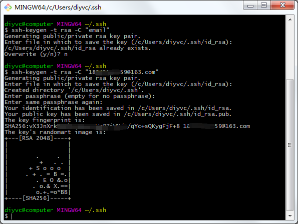
生成如上图所示标识生成成功了,存放在用户文件夹下。
3.将SSH key添加到Github中
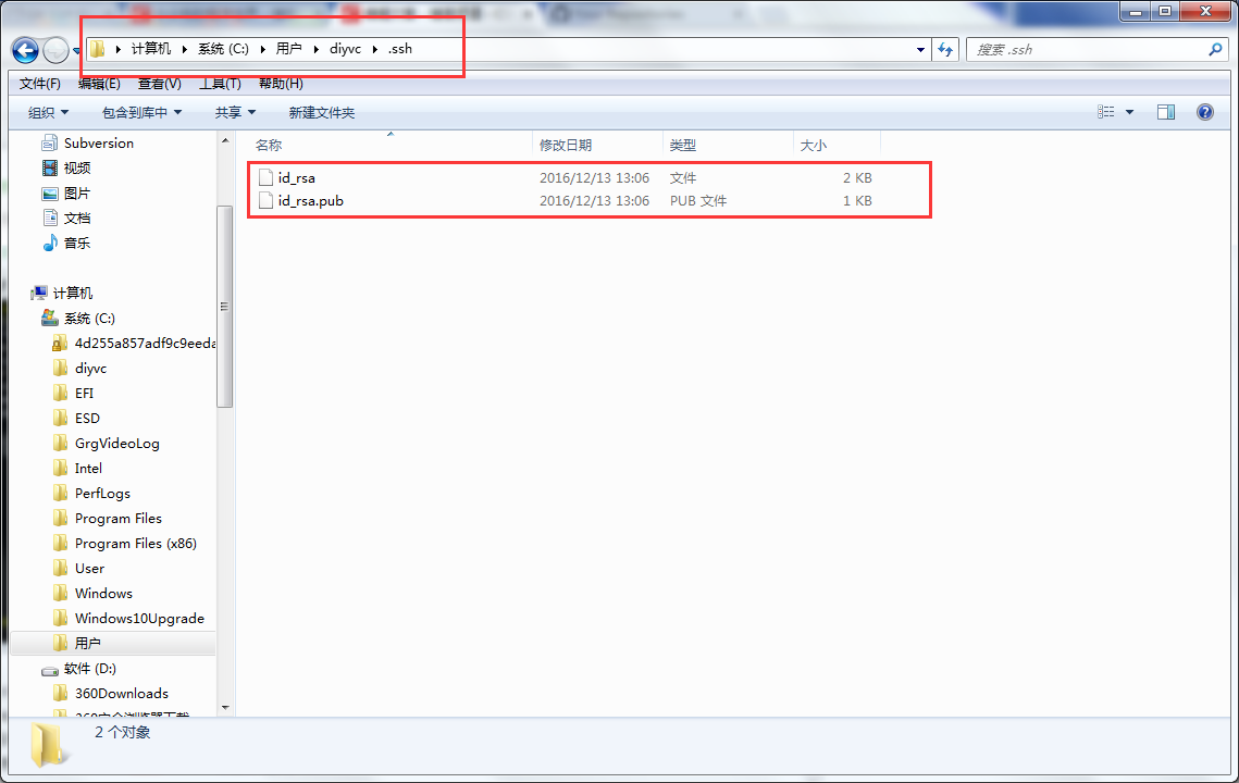
登录GitHub,在账号设置的Settings→SSH and GPG keys→New SSH key,输入一个title和Key。Key在 .ssh的 id_rsa.pub里面,打开它,将密钥复制进去就可以了。
4.配置账户
Git Bash输入
$ git config --global user.name “your_username”  #设置用户名
$ git config --global user.email “your_registered_github_Email”  #设置邮箱地址(用注册Github的邮箱)
5.测试SSH key是否设置成功
Git Bash输入 $ ssh -T git@github.com,一般会出现
The authenticity of host 'github.com (192.30.253.112)' can't be established.
RSA key fingerprint is SHA256:nThbg6*******************ARLviKw6E5SY8.
Are you sure you want to continue connecting (yes/no)? yes #确认你是否继续连接,输入yes
Warning: Permanently added 'github.com,192.30.253.112' (RSA) to the list of known hosts.
Enter passphrase for key '/c/Users/xxxx_000/.ssh/id_rsa': #生成ssh kye是密码为空则无此项,若设置有密码则有此项,输入生成ssh key时设置的密码即可。6.将本地项目通过SSH提交到GitHub上
打开Github存储着Github Pages的仓库,进入配置页: Settings – SSH and GPG keys,添加本地生成的ssh秘钥,选择New SSH key,复制 id_rsa.pub的密钥到Key中。
再次测试一下,在存放着本地站点的文件夹中Git Bash,输入 ssh -T git@github.com ,出现类似Successfully或者类似字样,代表成功了,这样就可以将本地站点文件推送到远方的Github仓库中。
现在在本地站点文件夹打开Git Bash,输入 hexo deploy,将本地站点推送到Github仓库。这样就部署完成了。
部署更新
$ hexo deploy还可简写为 hexo d[1]。
参见文档: Deployment
Github Action 自动部署与移动端编辑
站点部署后,文件由于放在电脑本地,这样如果在外面或需要用移动端进行编辑的时候,就因为无法部署到远程仓库而只能等待下次使用电脑,很不方便。通过Github Action可以将站点文件的部署流程也一起提交到远端,这样部署就不会受到设备的限制,随时随地都可以提交改动。
要实现自动部署,我们需要:
- 一个 GitHub Pages 仓库
- 一个 Hexo 站点备份仓库/分支
- GitHub Personal Access Token 用于获取仓库的推送权限
为了方便管理和保护隐私,我另外创建了一个仓库用于管理站点文件,这样我的文章尤其是加密的文章就不会因为Github Pages公开而一起公开。直接将本地的站点文件复制到另一个文件夹,用Github Desktop程序设定新文件夹为新仓库的本地文件。由于事先设定了SSH Key并指定了唯一仓库,在新的文件夹也可以执行原来的Hexo命令。当然使用原来的分支也可以,只是在最后 push 的时候分支设置略有区别。
不管文件目录在哪,一般Hexo站点文件最少都应包括这些文件:
│ package.json
│ .gitignore
│ _config.yml
├─scaffolds
│      draft.md
│      page.md
│      post.md
├─source
│   ├─xxxxxx
│   ├─xxxxxx
│   └─_posts
│      ├─xxxxxx
│      └─xxxxxx
└─themes(或node_modules下对应的主题文件)
    └─xxxxxx
如果之前安装了其他组件,要求在文件夹根目录建立文件,则这些文件也要推送,如 hexo-generator-search,需要推送根目录的 search.xml。
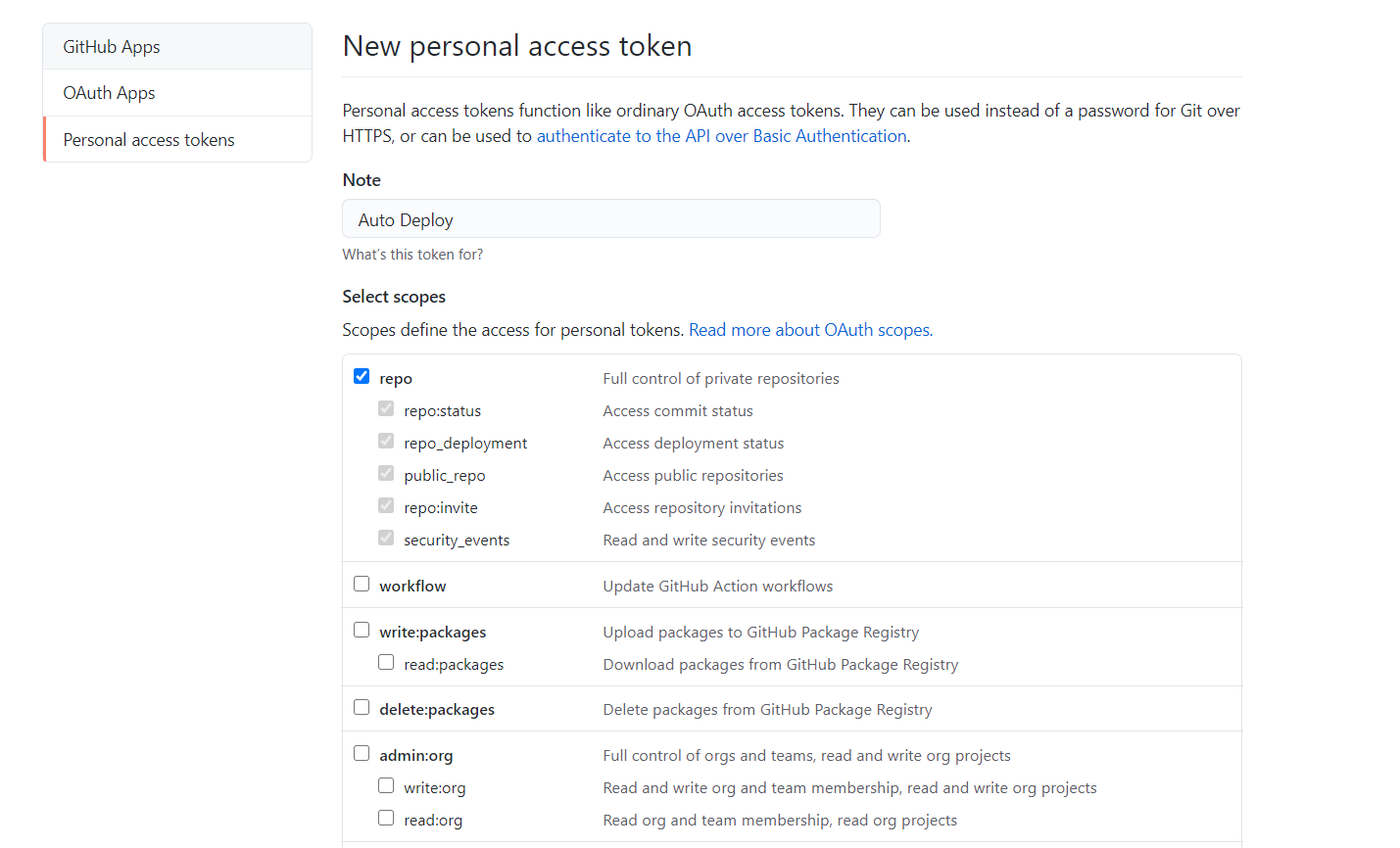
设置 GitHub Personal Access Token
点击 GitHub 用户设置页面 最下方的 Developer setting,然后选择 Personal access tokens来生成一个 token,由于我们只需要能够对普通仓库 push (推送)就行了,所以把 Select scopes的 repo部分勾上即可。生成的 token 只会显示一次,所以一定要及时保存下来,否则就只能删除重新创建了。
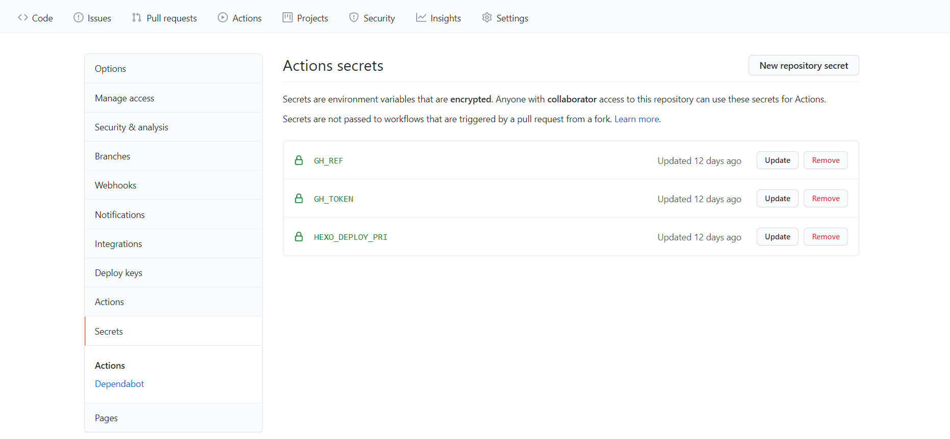
在Github网页,找到Hexo站点文件仓库,在上方的Settings,点到左侧的 Secrets 项,添加两个秘密环境变量 GH_REF 、GH_TOKEN,值分别填写自己的 GitHub Pages 仓库地址(不包含 https://)和刚刚申请到的 GitHub Personal Access Token。
配置 Github Action
设置触发条件和工作环境
我设置在 hexo 分支上发生 push 操作时触发构建,使用最新的 Ubuntu 系统作为编译部署的环境,同时设置一个全局环境变量将时区修改为 Asia/Shanghai ,具体的配置内容如下:
之所以先设定时区,是因为 Github Action 自动部署提交 commit 的时区默认为美国太平洋时间。如果按 :year/:i_month:day-:id 的格式组织文章链接会导致文章生成错误(因为填写时间一般都是按所在地时间来),因此自动部署后如果经常在东西半球旅行写文章,需要特别注意时区。
然后检出代码,设置 node 环境,我们这里使用 12.x 版本的 node.js,一些插件并未适配最新版本的 node.js,所以设置为更稳定的12.x。
name: Github Pages CI/CD

# Controls when the action will run.
on:
  # Triggers the workflow on push or pull request events but only for the hexo branch
  push:
    branches: hexo # 这个分支名需要按照你的设置来

env:
  GIT_USER: Github用户名
  GIT_EMAIL: Github账号当前使用的邮箱
  TZ: Asia/Shanghai # 必填,时间,建议为你常住地的时间

jobs:
  blog-cicd:
    name: Hexo blog build & deploy
    runs-on: ubuntu-latest

    steps:
    - name: Checkout codes
      uses: actions/checkout@v2

    - name: Setup node
      uses: actions/setup-node@v1
      with:
        node-version: '12.x'
生成和部署文件
由于每次运行 Action 流程都在服务器上进行,因此需要安装依赖和插件。如果使用了 gulp 任务来压缩 Hexo 生成的文件,gulp 安装命令也一并加上,没有的话就别加以免浪费部署时间。
- name: Install dependencies
  run: |
    npm install hexo-cli gulp -g
    npm install
环境配置好后,就和我们通常的部署流程大同小异了。
- name: Generate files
  run: hexo generate

- name: Execute gulp task
  run: gulp
部署时有几点需要注意的,我在这里翻车了很多次。
首先自动部署是云端进行的,需要先将 GitHub Pages 仓库克隆过来,将其中的 .git 目录移到存放部署文件的 public 目录中(为了保留 GitHub Pages 仓库的提交历史)。
为了防止 git 服务器出现没有适当的证书这种情况,需要关闭证书验证,然后再进行克隆。当然这样安全性会降低一些但其实也没什么影响。
git config http.sslVerify "false"
git clone "https://${{ secrets.GH_REF }}" deploy_git
由于仓库不知为何变成了浅层克隆,出现 shallow update not allowed因此需要以下命令拉取所有内容。
git fetch --unshallow origin
最后使用 git 的提交命令提交即可。提交后Github会自动进行一次测试以检验是否有效,如果部署失败会自动发送一封邮件通知。
我的最终文件如下:
name: Github Pages CI/CD

on:
  push:
    branches: hexo

env:
  GIT_USER: Github用户名
  GIT_EMAIL: Github账号使用的邮箱
  TZ: Asia/Shanghai

jobs:
  blog-cicd:
    name: Hexo pages build & deploy
    runs-on: ubuntu-latest

    steps:
      - name: Checkout codes
        uses: actions/checkout@v2

      - name: Setup node
        uses: actions/setup-node@v1
        with:
          node-version: '12.x'

      - name: Install dependencies
        run: |
          npm install hexo-cli -g
          npm install
      - name: Generate files
        run: |
          hexo generate
          hexo douban

      - name: Hexo deploy
        run: |
          git config --global http.sslVerify false
          git clone "https://${{ secrets.GH_REF }}" deploy_git
          git fetch --unshallow origin
          mv ./deploy_git/.git ./public/
          cd ./public
          git config --global user.name $GIT_USER
          git config --global user.email $GIT_EMAIL
          git config user.name "自动部署提交的用户名义,随便写"
          git config user.email "自动部署提交的用户名义的邮箱,随便写"
          git add .
          git commit -m "GitHub Actions Auto Builder at $(date +'%Y-%m-%d %H:%M:%S')"
          git push --force --quiet "https://${{ secrets.GH_TOKEN }}@${{ secrets.GH_REF }}" main:main
移动端编辑方案:安装一个后端
Hexo对多端编辑天然排斥,进行移动端编辑必须配置Github Actions,除非选择在Github源码仓库直接进行编辑,但这样效率很低。因此可选择通过安装后端插件如Qexo进行编辑。Qexo的部署方式比较简单,官方文档介绍也比较详细,不再重复。
奇特的报错
Accessing non-existent property ‘xxx’ of module exports inside circular dependency
运行 hexo s时出现如下信息,但不影响程序运行。
$ hexo s
(node:87224) Warning: Accessing non-existent property 'lineno' of module exports inside circular dependency
(Use `node --trace-warnings ...` to show where the warning was created)
(node:87224) Warning: Accessing non-existent property 'column' of module exports inside circular dependency
(node:87224) Warning: Accessing non-existent property 'filename' of module exports inside circular dependency
(node:87224) Warning: Accessing non-existent property 'lineno' of module exports inside circular dependency
(node:87224) Warning: Accessing non-existent property 'column' of module exports inside circular dependency
(node:87224) Warning: Accessing non-existent property 'filename' of module exports inside circular dependency
原因是 node.js 升级到版本 14 后,Hexo 的相关依赖没有更新。
解决方法:重装 hexo-renderer-stylus(stylus在0.54.8以上)和 nib,nib好像有更新到1.1.3,但没有新发行版,可以直接从Github上拉取,然后修改 package.json和 package-lock.json文件的版本即可。
选择主题
Hexo默认的Landscape可自定义的内容主题比较简陋,如果想要自己的站点更好看,Hexo的主题页面收录丰富的主题供选择。
其中Next主题是其中最受欢迎的,站点在最初写下这篇文章时使用的正是这个主题。不过NExT主题的局限性随着使用的人日趋增多而愈发明显,一是可通过主题配置文件简单自定义的内容较少,大多数美化都需要自行编写代码,二是无论怎么美化都不会脱离最初的主题框架,这又必然导致站点界面的同质化。因此之后我又尝试了几种主题。
安装和调试Next主题,可以直接参考文档。特别提醒,如果读者和我一样对Git完全不熟的话,还是选择“下载源代码”为好,当初“克隆最新版本”给我带来了不少麻烦,比如无法推送主题文件到仓库,而且这个问题至今没有解决。
根据一般大主题的文档附带的注释,加上一点英文理解,就可以直接改站点和主题的YAML配置文件。主题不同,可配置的内容会有差异,某种程度上可以说一个主题的特色就在于主题配置文档中。都用主题了肯定是不愿意花太多时间写代码的啦对于主题配置文件未提到的修改,可以通过在 \source\_data下创建对应的文件,实现不修改源代码的情况下自定义主题的样式,不过如果还要进一步魔改,只有改源码了。
其他与Hexo相关的命令
从远程仓库拉取(同步)
适用于在其他地方更新了远程仓库比如说移动端编辑,那么此时所在本地的仓库版本是低于远程仓库的,这时就要用到它。
git pull origin source
本地内容提交到远程仓库
另外一种方法。
git add .
git commit -m "提交说明"
git push -u origin source
更换预览端口
hexo server -p 6000
排除错误
在出现错误的命令后添加 --debug。
进阶配置
使用站点配置文件 _config.yml可以进行基本配置无论何种主题,有些共同的工作都是要做的,接下来将记录这些工作。
新建页面
一个Hexo构建的页面最初只有首页和归档,对于一个站点而言这多半是不够的,因此需要新建 分类、标签、关于、友链、404首先要在主题中开启这些页面的菜单入口,一般是在主题配置文件下的 menu 一栏修改,大多数主题的格式都是:
菜单名: /菜单目录 || 菜单图标名字
有些主题还会支持二级菜单,如Volantis主题:
分类: /categories/ || fas fa-folder-open
更多||fas fa-ellipsis-v:
  影视: /movies/ || fas fa-video
  图书: /books/ || fas fa-book-open
  游戏: /games/ || fas fa-gamepad
建立入口之后,需要创建这个页面,在根目录下Git Bash
hexo new page xxxxxx为要创建的页面,这样就会在 \source文件夹下创建对应页面的文件夹,里面有一个 index.md 文件,可以根据自己的需要在这个 Markdown 文件中写一些内容,就像写文章一样。
404页面一般需要设置 layout: false避免主题渲染成类似文章一样的页面,HTML代码可自行设定。
RSS订阅
安装插件:
npm install hexo-generator-feed --save在站点配置文件 _config.yml中添加以下代码:
# RSS
feed:
  type: atom # RSS的类型(atom/rss2),设定为 ['atom', 'rss2'] 则两者都启用
  path: feed.xml # 文件路径
  limit: 20 # 展示文章的数量,使用 0 或 false 代表展示全部
  hub: # PubSubHubbub URL,不需要则留空
  content: # 可选,在RSS文件中是否包含整个页面的内容,默认不填为false
  content_limit: 140  # 可选,自动截取的摘要长度
  content_limit_delim: ' ' # 可选,手动截取摘要的分隔符,启用后RSS文件只会显示页面的摘要
  order_by: -date # 文章顺序
  icon: icon.png # feed 图标
  autodiscovery: true # Add feed autodiscovery.
  template: # XML模板路径。这个文件将被用来生成 xml 文件。自带两个默认模板:atom.xml 和 rss2.xml。
配置完成后,即可看到可生成全文的RSS源。
为Github Pages配置Websub
使用谷歌提供的PubSubHubbub 工具,查看是否成功传输到读者端。填入 Feed URL,然后 Get Info。
WebSub 前身为 PubSubHubbub,原本由 Google 开发,现为 W3C 下的开源协议。WebSub 基于 webhook ,用于发布者与订阅者之间的通信。hub 中转验证订阅者发来的订阅请求。当有更新,hub 将发布者的新内容分发到订阅者手中。
每当你更新一篇文章,就会通知「中转」,支持 WebSub 的 Feed 解析器收到有新内容的通知。相比之前不断地下载 Feed,使用 WebSub 后,将大大减少下载次数,做到「有更才下」。
在 feed配置的设置 hub: https://pubsubhubbub.appspot.com。
在 GitHub Pages 仓库下,Settings -> Webhooks -> Add webhook,Add Webhook。
Payload URL填写为:
Pubsubhubbub URL?hub.mode=publish&hub.url=你的站点 Feed URL
Content type选 application/x-www-form-urlencoded。
在 Which events would you like to trigger this webhook? 问题下,选 Let me select individual events.,然后仅选 Page builds。
手动激活 Webhook 进行测试,在 Recent Deliveries 下查看 Response 结果,得到结果 204 意味测试成功。
自定义xml文件的模板的实践
通过设置template参数,可以自定义RSS的xml文件格式。初始模板可从插件的仓库(atom、rss2)中下载。
初始模板中,源的author参数是feed.xml的全局属性,我希望在文章Front-matter中配置版权相关参数后,能让xml文件根据每篇文章不同的设置独立输出不同的author参数。例如设置某篇的作者是小明,希望RSS源的文章也能出现他的名字(实际能否出现取决于阅读器设置)。因此仿照初始模板的写法,首先我需要在站点配置文件设置email参数,然后将初始模板复制到本地,在<entry>属性下增加内容:
<author>
{% if post.copyright_author %}
    <name>{{ post.copyright_author }}</name>
    {% if post.copyright_author_href %}<uri>{{ post.copyright_author_href }}</uri>{% endif %}
{% elif config.author %}
    <name>{{ config.author }}</name>
    {% if config.email %}<email>{{ config.email }}</email>{% endif %}
{% endif %}
</author>
选择评论系统
Hexo支持的评论系统很多,可参见各个主题和评论的配置文档。
本站选择了Gitalk和Waline两个评论系统,Gitalk配置很简单,这里不细说,说说Waline吧。
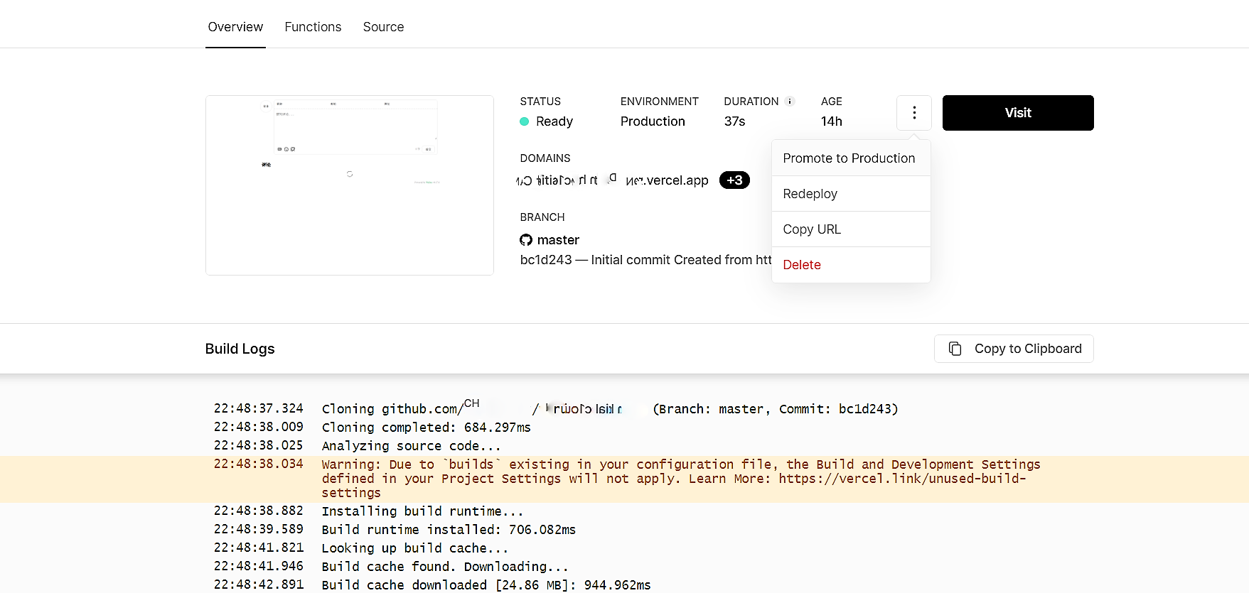
我把Waline的服务端放在了Vercel,因此需要更改环境变量,但每次环境变量配置完后,根据文档需要重新部署,但怎么重新部署文档没说清楚,仓库的Issues也没人提出这个问题(或许是这个步骤太简单了吧)。一开始我以为是Github仓库重新部署,部署后发现不生效,后来一想被自己笑到,明明是服务端更新了怎么会跑去仓库部署。但Vercel怎么重新部署,网站文档也没讲清楚。
一次偶然机会,我才发现了重新部署在Vercel项目下的Deployments菜单,选择最近一次Deployments进入,在 Visit按钮旁边的选单中有一个 Redeploy,就是它了。
图床
开启本地图床
安装 hexo-asset-image插件
npm install hexo-asset-image --save在站点配置文件 _config.yml中,设置 post_asset_folder: true。之后每当生成新页面时,hexo会自动在/source/_posts目录下创建同名的文件夹,只需在Markdown文档里使用 ,无需路径名就可以插入图片。
图床网站
推荐 牛图网、imgbb、 sm.ms 图床(需要注册账号)、catbox.moe 图床(它还可以存储音频,中国大陆无法访问,适合境外存储)、Imgur(图片社区,可以传图,但中国大陆地区无法访问)。
阿里云OSS+PicGo上传
本来没有打算使用付费的云服务的,可阿里云对象存储服务(OSS)价格实在太便宜了,1年8元。而且阿里云服务稳定,既不用担心 sm.ms 没有自定义域名,害怕上传的图片找不到,也没有Github和Onedrive的滥用或随时可能到期的顾虑,更不用考虑阿里云的突然蒸发问题。使用阿里云还有另一个优势,便是可以自动压缩和转换图片格式为.webp,以及防盗链和自定义域名。甚至可以托管像本站这样的静态网站
如果域名没有ICP备案的话,Bucket地域建议选择中国(香港)。防盗链配置的话需要添加协议,还有本地预览的地址也要加上(通配符有没有用没有试)。修改读写权限为“读写权限”,配合PicGo软件同样可以实现自动上传,简单高效。
当然也有缺点,手机上传图比较麻烦,打开阿里云的控制台各种验证也很麻烦。以及容易被跑流量。
Cloudflare R2存储+Pages配置图床
一定额度内免费,且可享受Cloudflare的CDN加速服务,是自建图床的不错选择,唯一缺点可能是存储空间较小(10GB)。具体配置可参见文档。
文章永久链接
Hexo在生成博客文章链接时,默认是按照年、月、日、标题格式来生成,这样对中文在生成链接时会被转码,导致链接过长,对访客不友好,同时一旦更改文章标题,原URL就会失效,不易保存分享。利用hexo-abbrlink插件可以为每篇文章自动生成或手动指定一个abbrlink,这样除非删除文章,就能保证生成的链接能永久生效。
安装 hexo-abbrlink2插件
npm install hexo-abbrlink2 --save设定 站点配置文件中的文章生成链接 permalink:
permalink: posts/:abbrlink/自动生成是在 hexo generate命令时会为每篇第一次生成的文章自动指定一个永久id(不是在创建新文章时)。自动生成有两种方式:
第一种是依靠自动算法,在 站点配置文件的 permalink下一行:
permalink: posts/:abbrlink/
pid:
    alg: crc32   #算法: crc16(default) and crc32
    rep: hex     #进制: dec(default) and hex
会自动生成形如以下的格式:
crc16 & hex
    https://post.zz173.com/posts/66c8.html

crc16 & dec
    https://post.zz173.com/posts/65535.html

crc32 & hex
    https://post.zz173.com/posts/8ddf18fb.html

crc32 & dec
    https://post.zz173.com/posts/1690090958.html
第二种为每篇文章手动指定abbrlink的方式,在需要指定文章的Front-Matter中加入 pid: 1即可。
第三种是指定文章开始的id,之后按数字逐次添加,但这样大批量生成文章时id很容易重复,不建议使用此方法。
站点地图与搜索引擎收录
通过设置站点地图,可以便捷地让各大搜索引擎收录站点内容,同时也可以避免一些不想公开在搜索引擎的内容被自动收录。新建的GitHub Pages或其他新的站点短时间内一般不会被谷歌检索,但长时间可能会被谷歌的爬虫爬到一些内容 而百度倒不用担心毕竟Github Pages部分早已屏蔽百度索引,所以需尽早向搜索引擎提交站点地图(其实不提交搜索引擎最后也会索引到站点地图)。
建立站点地图需要安装相关插件。对于谷歌和必应等国外搜索引擎,安装 hexo-generator-sitemap插件,对百度则安装 hexo-generator-baidu-sitemap插件。
npm install hexo-generator-sitemap --save在站点配置文件 _config.yml中设置站点地图参数。
sitemap:
  path: sitemap.xml # 站点地图文件生成
  template: ./sitemap_template.xml # 站点地图文件所采用的模板目录,没有建议删除
  rel: false # 添加 rel-sitemap 在每个网页的 header.
  tags: true # Add site's tags
  categories: true # Add site's categories
如果不希望某个页面被站点地图收录,可在每个文章或页面.md文件的Front-Matter添加 sitemap: false。
谷歌收录
前往GoogleSearchConsole,按照网站引导添加站点地图。至于Github Pages验证方式,如果主题支持按照主题的引导,如果主题不支持,只能使用HTML标记法验证所有权了。相比之下,有个域名要轻松得多。
必应收录
前往Bing Webmaster Tools提交,如果之前已经在谷歌提交的话,必应支持谷歌直接导入,验证所有权会方便许多,当然站点地图还是要手动提交。
建立不受主题渲染的页面
方法一
使用 Hexo 提供的跳过渲染配置,在站点的配置文件 _config.yml 里找到 skip_render 关键字,在后面添加想要跳过渲染的页面,比如创建 \source\about\index.html, 配置文件填写:skip_render: about\**,那么就表示 \source\about 里所有的文件将跳过渲染,里面的文件将会被直接复制到 public 文件夹,此时就会得到一个独立的 about 页面。
方法二
在文章头部的 Front-matter 里添加配置 layout: false 来跳过渲染配置,比如我们要使 about 页面跳过渲染,创建 \source\about\index.md,将这个页面的相关 HTML 代码写进.md文件并保存。
压缩静态资源
由于静态站点,相关文件很多,加载起来比较费时间。gulp能够帮助用户自动压缩静态资源,配合各类下属插件,能够压缩包括css、js、html乃至各类格式的图片文件。
首先安装 gulp的主要插件。
npm install --global gulp-cli #全局安装gulp指令集
npm install gulp --save #安装gulp插件
安装下属的压缩插件。目前图片压缩效果不佳,暂时放弃。
npm install gulp-htmlclean --save-dev #压缩html
npm install gulp-html-minifier-terser --save-dev # 用gulp-html-minifier-terser可以压缩HTML中的ES6语法
npm install gulp-clean-css --save-dev #压缩css
npm install gulp-terser --save-dev #压缩js,但会失去IE等老旧浏览器的兼容性
安装完成后,在站点根目录下新建并编写 gulpfile.js任务脚本,此处直接照搬了Akilar的示例,字体压缩仅支持 .tff文件[2],本站没有采用压缩字体部分的内容。
//用到的各个插件
import { createRequire } from 'module';
const require = createRequire(import.meta.url);
var gulp = require('gulp');
var cleanCSS = require('gulp-clean-css');
var htmlmin = require('gulp-html-minifier-terser');
var htmlclean = require('gulp-htmlclean');
var fontmin = require('gulp-fontmin');
// gulp-tester
var terser = require('gulp-terser');
// 压缩js
gulp.task('compress', async() =>{
  gulp.src(['./public/**/*.js', '!./public/**/*.min.js'])
    .pipe(terser())
    .pipe(gulp.dest('./public'))
});
//压缩css
gulp.task('minify-css', () => {
    return gulp.src(['./public/**/*.css'])
        .pipe(cleanCSS({
            compatibility: 'ie11'
        }))
        .pipe(gulp.dest('./public'));
});
//压缩html
gulp.task('minify-html', () => {
    return gulp.src('./public/**/*.html')
        .pipe(htmlclean())
        .pipe(htmlmin({
            removeComments: true, //清除html注释
            collapseWhitespace: true, //压缩html
            collapseBooleanAttributes: true,
            //省略布尔属性的值,例如:<input checked="true"/> ==> <input />
            removeEmptyAttributes: true,
            //删除所有空格作属性值,例如:<input id="" /> ==> <input />
            removeScriptTypeAttributes: true,
            //删除<script>的type="text/javascript"
            removeStyleLinkTypeAttributes: true,
            //删除<style>和<link>的 type="text/css"
            minifyJS: true, //压缩页面 JS
            minifyCSS: true, //压缩页面 CSS
            minifyURLs: true  //压缩页面URL
        }))
        .pipe(gulp.dest('./public'))
});
//压缩字体
function minifyFont(text, cb) {
  gulp
    .src('./public/fonts/*.ttf') //原字体所在目录
    .pipe(fontmin({
      text: text
    }))
    .pipe(gulp.dest('./public/fontsdest/')) //压缩后的输出目录
    .on('end', cb);
}

gulp.task('mini-font', (cb) => {
  var buffers = [];
  gulp
    .src(['./public/**/*.html']) //HTML文件所在目录请根据自身情况修改
    .on('data', function(file) {
      buffers.push(file.contents);
    })
    .on('end', function() {
      var text = Buffer.concat(buffers).toString('utf-8');
      minifyFont(text, cb);
    });
});
// 运行gulp命令时依次执行以下任务
gulp.task('default', gulp.parallel(
  'compress', 'minify-css', 'minify-html','mini-font'
))
Akilar对字体压缩
font-min的补充说明,在本文中,是通过读取所有编译好的html文件(./public/**/*.html)中的字符,然后匹配原有字体包内./public/fonts/*.ttf字体样式,输出压缩后的字体包到./public/fontsdest/目录。所以最终引用字体的相对路径应该是/fontsdest/*.ttf。而本地测试时,如果没有运行gulp,自然也就不会输出压缩字体包到public目录,也就看不到字体样式。
在每次运行完 hexo generate生成静态页面后,运行 gulp命令对 站点根目录\public目录下的文件进行压缩,建议先在本地调试。
NExT主题自定义样式记录
万一以后用得上呢~
实现置顶效果
网络上已经有无数的文章说到了如何在NExT中实现文章置顶,首先安装hexo-generator-index-pin-top插件:
npm uninstall hexo-generator-index --save
npm install hexo-generator-index-pin-top --save
然后在需要置顶的文章的 Front-matter中加上 top: true即可。
但问题在于,置顶的文章并没有置顶标签,需要在 站点根目录\source\_data\post_meta.njk中添加自定义样式:
{% if post.top %}
  <i class="fa fa-thumb-tack"></i>
  <font color=7D26CD>置顶</font>
  <span class="post-meta-divider">|</span>
{% endif %}
问题在于这样加入的置顶标签会失去间隔效果,但解决的代码我忘记保存了……
侧边栏添加近期文章
在 \source\_data\sidebar.njk。
{% if theme.recent_posts %}
    <div class="links-of-blogroll motion-element {{ "links-of-blogroll-" + theme.recent_posts_layout  }}">
      <div class="links-of-blogroll-title">
        <!-- 选择合适的icon -->
        <i class="fa fa-history fa-{{ theme.recent_posts_icon | lower }}" aria-hidden="true"></i>
 		<!-- 这里对应下文主题配置文件的recent_posts_title值 -->
        {{ theme.recent_posts_title }}
      </div>
      <ul class="links-of-blogroll-list">
         <!-- 设置排序规格,此处我采用按照文章更新时间排序 -->
        {% set posts = site.posts.sort('-updated').toArray() %}
        <!-- 显示三条近期文章,请自信合理配置 -->
        {% for post in posts.slice('0', '3') %}
          <li>
            <a href="{{ url_for(post.path) }}" title="{{ post.title }}" target="_blank">{{ post.title }}</a>
          </li>
        {% endfor %}
      </ul>
    </div>
{% endif %}
文章分享
安装插件 hexo-next-share。
npm install theme-next/hexo-next-share --save在主题配置文件添加如下内容,之后自定义需要添加的分享按钮。
# NeedMoreShare2
# Dependencies: https://github.com/theme-next/theme-next-needmoreshare2
# For more information: https://github.com/revir/need-more-share2
# iconStyle: default | box
# boxForm: horizontal | vertical
# position: top / middle / bottom + Left / Center / Right
# networks:
# Weibo | Wechat | Douban | QQZone | Twitter | Facebook | Linkedin | Mailto | Reddit | Delicious | StumbleUpon | Pinterest
# GooglePlus | Tumblr | GoogleBookmarks | Newsvine | Evernote | Friendfeed | Vkontakte | Odnoklassniki | Mailru
needmoreshare:
  enable: true
  cdn:
    js: //cdn.jsdelivr.net/gh/theme-next/theme-next-needmoreshare2@1/needsharebutton.min.js
    css: //cdn.jsdelivr.net/gh/theme-next/theme-next-needmoreshare2@1/needsharebutton.min.css
  postbottom:
    enable: true
    options:
      iconStyle: box
      boxForm: horizontal
      position: bottomCenter
      networks: Weibo,Wechat,Douban,QQZone,Twitter,Facebook
  float:
    enable: false
    options:
      iconStyle: box
      boxForm: horizontal
      position: middleRight
      networks: Weibo,Wechat,Douban,QQZone,Twitter,Facebook
footer加入运行时间
在 \source\_data\sidebar.njk。这个在其他主题同样可用,如果是Butterfly主题,直接在 _config.butterfly.yml相应设置项添加即可。
<!-- 网站运行时间的设置 -->
<div id="time">
<span id="timeDate">载入天数...</span>
<span id="times">载入时分秒...</span>
<script>
    var now = new Date();
    function createtime() {
        var grt= new Date("02/16/2016 12:01:00");//此处修改你的建站时间,注意格式
        now.setTime(now.getTime()+250);
        days = (now - grt ) / 1000 / 60 / 60 / 24; dnum = Math.floor(days);
        hours = (now - grt ) / 1000 / 60 / 60 - (24 * dnum); hnum = Math.floor(hours);
        if(String(hnum).length ==1 ){hnum = "0" + hnum;} minutes = (now - grt ) / 1000 /60 - (24 * 60 * dnum) - (60 * hnum);
        mnum = Math.floor(minutes); if(String(mnum).length ==1 ){mnum = "0" + mnum;}
        seconds = (now - grt ) / 1000 - (24 * 60 * 60 * dnum) - (60 * 60 * hnum) - (60 * mnum);
        snum = Math.round(seconds); if(String(snum).length ==1 ){snum = "0" + snum;}
        document.getElementById("timeDate").innerHTML = "小站在 Github 服务器上托管了 "+dnum+" 天 ";
        document.getElementById("times").innerHTML = hnum + " 小时 " + mnum + " 分 " + snum + " 秒";
    }
setInterval("createtime()",250);
</script>
</div>
Volantis主题自定义样式记录
文章页首行缩进开关
文字类尤其是以中文为主的文章最好还是开启首行缩进,但也不是所有文章,比如一些技术文章都适合首行缩进,此处是做了一个开关,通过 page.indent 控制是否首行缩进。
修改 article.ejs,在最前面 article 的 class 中添加对应样式:
<article class="<%- page.indent == true ? 'cus-indent' : '' %> article post white-box reveal md <%- theme.custom_css.body.effect.join(' ') %> article-type-<%= post.layout %>" id="<%= post.layout %>" itemscope itemprop="blogPost">在自定义CSS样式文件中添加以下内容:
#article-container
p{
text-indent: 2em;
}
#article-container detail p{ text-indent: 0em !important; }
#article-container blockquote p{ text-indent: 0em !important; }
#article-container section p{ text-indent: 0em !important; }
#article-container .prev-next p{ text-indent: 0em !important; }
#article-container .new-meta-box p{ text-indent: 0em !important; }
#article-container .note p{ text-indent: 0em !important; }
#article-container .tag p{ text-indent: 0em !important; }
Butterfly主题自定义样式记录
Tag Plugins Plus 插件
参见Butterfly 主题外挂标签的语法手册。本站已不再使用。
增加站点数据统计图表
使用插件 hexo-butterfly-charts(Github地址,使用文档))。
npm i hexo-butterfly-charts --save
在主题配置文件 _config.butterfly.yml 或站点配置文件 _config.yml 中增加以下内容:
# 统计图表,支持发布文章统计、发布日历、Top标签统计、分类统计、分类雷达。
# see https://www.npmjs.com/package/hexo-butterfly-charts
charts:
  enable: true # 是否启用功能
  postsChart:
    title: 文章发布统计 # 设置文章发布统计的标题,默认为空
    interval: 1 # 横坐标间隔
  tagsChart:
    title: Top 10 标签统计 # 设置标签统计的标题,默认为空
    interval: 1 # 横坐标间隔
  postsCalendar_Title: #文章发布日历 # 设置发布日历的标题,默认为空
  categoriesChart_Title: # 设置分类统计的标题,默认为空
categoriesRadar_Title: # 设置分类雷达的标题,默认为空本站在归档、分类、标签页面使用了其中部分图表,所有图表放在更新记录页面。其中:
- 归档页面:发布日历。在
theme/Butterfly/layout/archive.pug文件中,#archive下面添加一行#posts-calendar,注意缩进。 - 分类页面:在
/Butterfly/layout/includes/page/categories.pug文件中,第 5 行添加#categories-chart,修改后的文件如下所示:
.category-lists
  .category-title.is-center= _p('page.category')
    |  -
    span.category-amount= site.categories.length
  div!= list_categories()
  #categories-chart
#categories-radar- 标签页面:标签统计。在
theme/Butterfly/layout/includes/page/tags.pug文件中,开头添加一行#tags-chart(data-length = "10"),data-length = "10",表示显示 Top 10 的标签。
分类和标签页面导航栏
原版Butterfly主题的分类和标签页面比较简陋,而且查看不便,尤其是标签页面没有展示数字,因此为其增加了导航栏和标签数。
首先介绍如何在原版标签页面增加标签数。步骤非常简单,通过检查标签页生成代码,可以发现标签绘制使用了 cloudTags函数,在文件夹搜索 cloudTags,可以看到标签云渲染的代码在 站点根目录\themes\butterfly\scripts\helpers\page.js,因此只需要对此文件进行修改。
hexo.extend.helper.register('cloudTags', function (options = {}) {
  const theme = hexo.theme.config
  const env = this
  let source = options.source
  const minfontsize = options.minfontsize
  const maxfontsize = options.maxfontsize
  const limit = options.limit
  const unit = options.unit || 'px'

  let result = ''
  if (limit > 0) {
    source = source.limit(limit)
  }

  const sizes = []
  source.sort('length').forEach(tag => {
    const { length } = tag
    if (sizes.includes(length)) return
    sizes.push(length)
  })

  const length = sizes.length - 1
  source.forEach(tag => {
    const ratio = length ? sizes.indexOf(tag.length) / length : 0
    const size = minfontsize + ((maxfontsize - minfontsize) * ratio)
    let style = `font-size: ${parseFloat(size.toFixed(2))}${unit};`
    const color = 'rgb(' + Math.floor(Math.random() * 201) + ', ' + Math.floor(Math.random() * 201) + ', ' + Math.floor(Math.random() * 201) + ')' // 0,0,0 -> 200,200,200
    style += ` color: ${color}`
-   result += `<a href="${env.url_for(tag.path)}" style="${style}">${tag.name}</a>`
+   result += `<a href="${env.url_for(tag.path)}" style="${style}">${tag.name}<sup>${tag.length}</sup></a>`
  })
  return result
})
使用 <sup>${tag.length}</sup> 或 <sub>${tag.length}</sub> 可绘制表示标签文章数的上下标。
接下来是为分类和标签页添加导航条,方便从一个标签页快捷跳转到另一个标签页。在 站点根目录\themes\butterfly\scripts\helpers\ 目录下新建文件 catalog_list.js,代码如下所示。
hexo.extend.helper.register('catalog_list', function (type) {
  let html = ``
  hexo.locals.get(type).map(function (item) {
    html += `
    <div class="catalog-list-item" id="/${item.path}">
      <a href="/${item.path}">${item.name}<sup>${item.length}</sup></a>
    </div>
    `
  })
  return html
})其中,type 参数表示生成 分类导航栏 categories 还是 标签导航栏 tags,其中 <sup>${item.length}</sup> 是使用上标显示文章数量。
接下来是为导航条新增自定义样式,样式需要修改其中 --main、--second、--card-border rgba(150,150,150,0.2);、--light-text、--border-radius字段为自己偏好的设计。样式如下所示:
/* 分类目录条、标签目录条 */
#catalog-bar {
  padding: .4rem .8rem;
  border-radius: var(--border-radius);
  display: flex;
  border: var(--card-border);
  margin-bottom: 1rem;
  justify-content: space-between;
}

#catalog-bar:hover {
  border-color: var(--main);
}

#catalog-bar i {
  line-height: inherit;
}

#catalog-list {
  /* 分类/标签较少时,可以选择不设置 width,居中显示 catalog-list-item */
  /* width: 100%; */
  margin: 0 .5rem;
  display: flex;
  white-space: nowrap;
  overflow-x: scroll;
}

#catalog-list::-webkit-scrollbar {
  display: none;
}

.catalog-list-item a {
  margin: 0 .2em;
  padding: 0.2em 0.3em 0.3em;
  font-weight: bold;
  border-radius: var(--border-radius);
  color: var(--font-color);
  -webkit-transition: all .3s ease-in-out;
  -moz-transition: all .3s ease-in-out;
  -o-transition: all .3s ease-in-out;
  -ms-transition: all .3s ease-in-out;
  transition: all .3s ease-in-out;
}

.catalog-list-item:hover a {
  background: var(--main);
  color: var(--second);
}

.catalog-list-item.selected a {
  background: var(--light-text);
  color: var(--second);
}

a.catalog-more {
  min-width: fit-content;
  font-weight: bold;
  color: var(--font-color);
}

a.catalog-more:hover {
  color: var(--main);
}
样式添加完成后,在 站点根目录\themes\butterfly\layout\category.pug 调整为以下内容,注意缩进。
extends includes/layout.pug

block content
  if theme.category_ui == 'index'
    include ./includes/mixins/post-ui.pug
    #recent-posts.recent-posts.category_ui
      +postUI
      include includes/pagination.pug
  else
    include ./includes/mixins/article-sort.pug
    #category
      #catalog-bar
        i.fa-fw.fas.fa-shapes
        #catalog-list
          !=catalog_list("categories")
        a.catalog-more(href="/categories/")!= '更多'
      .article-sort-title= _p('page.category') + ' - ' + page.category
      +articleSort(page.posts)
      include includes/pagination.pug
category.pug 文件变化
+     #catalog-bar
+       i.fa-fw.fas.fa-tags
+       #catalog-list
+         !=catalog_list("tags")
+       a.catalog-more(href="/tags/")!= '更多'
在 站点根目录\themes\butterfly\layout\tag.pug 调整为以下内容,注意缩进。
extends includes/layout.pug

block content
  if theme.tag_ui == 'index'
    include ./includes/mixins/post-ui.pug
    #recent-posts.recent-posts
      +postUI
      include includes/pagination.pug
  else
    include ./includes/mixins/article-sort.pug
    #tag
      #catalog-bar
        i.fa-fw.fas.fa-tags
        #catalog-list
          !=catalog_list("tags")
        a.catalog-more(href="/tags/")!= '更多'
      .article-sort-title= _p('page.tag') + ' - ' + page.tag
      +articleSort(page.posts)
      include includes/pagination.pug
tag.pug 文件变化
+     #catalog-bar
+       i.fa-fw.fas.fa-tags
+       #catalog-list
+         !=catalog_list("tags")
+       a.catalog-more(href="/tags/")!= '更多'
如此,导航条基本成型,但还需要优化一下体验,做到在导航条中自动定位并高亮当前正在查看的分类或目录。在 站点根目录\source\js\目录下建立自定义JS,添加如下内容,可随意命名,之后在 _config.butterfly.yml设置引入该文件,即可重新生成预览查看效果。
function catalogActive () {
  let $list = document.getElementById('catalog-list')
  if ($list) {
    // 鼠标滚轮滚动
    $list.addEventListener('mousewheel', function (e) {
      // 计算鼠标滚轮滚动的距离
      $list.scrollLeft -= e.wheelDelta / 2
      // 阻止浏览器默认方法
      e.preventDefault()
    }, false)

    // 高亮当前页面对应的分类或标签
    let $catalog = document.getElementById(decodeURIComponent(window.location.pathname))
    $catalog.classList.add('selected')

    // 滚动当前页面对应的分类或标签到中部
    $list.scrollLeft = ($catalog.offsetLeft - $list.offsetLeft) - ($list.offsetWidth - $catalog.offsetWidth) / 2
  }
}
catalogActive()
增加页面跳转
方法来自轻笑Chuckle。直接修改 站点根目录\theme\butterfly\layout\includes\pagination.pug,将 else之后的代码替换如下:
else
  nav#pagination
    .pagination
      if is_home()
        - options.format = 'page/%d/'
      !=paginator(options)
      if is_home()
        input#textnumer(oninput="value=value.replace(/[^0-9]/g,'')" maxlength="3" onkeyup='this.value=this.value.replace(/[^u4e00-u9fa5w]/g,"")')
        a#textbtn(onclick='textbtn()') 跳转
    if is_home()
      .js-css
        script.
          function textbtn(){var e=document.querySelectorAll(".page-number"),t=e[e.length-1].innerHTML,n=Number(t),a=document.getElementById("textnumer"),o=Number(a.value);if(""!=o&&!isNaN(o)&&o%1==0)if(1==o)document.getElementById("textbtn").href="/";else if(o>n){var d="/page/"+n+"/";document.getElementById("textbtn").href=d}else d="/page/"+a.value+"/",document.getElementById("textbtn").href=d}
        style.
          #pagination .pagination .extend{display: none!important}
不过,只有首页可以跳转就显得有些鸡肋,毕竟首页只是个看新文章的页面和触达其他页面的入口。因此我又试着给归档、分类、标签增加了页面跳转功能,在原有代码上稍作修改:
else
  nav#pagination
    .pagination
      if globalPageType === 'home'
        - options.format = 'page/%d/#content-inner'
      !=paginator(options)
      if ['category', 'tag', 'home', 'archive'].includes(globalPageType)
        input#textnumer(oninput="value=value.replace(/[^0-9]/g,'')" maxlength="3" onkeyup='this.value=this.value.replace(/[^u4e00-u9fa5w]/g,"")')
        button#textbtn(type="button" onclick="handlePageJump()") 跳转
    if ['category', 'tag', 'home', 'archive'].includes(globalPageType)
      .js-css
        script.
          function handlePageJump() {
            // 获取输入值
            const inputVal = document.getElementById('textnumer').value;
            const pageNum = parseInt(inputVal);

            // 验证输入
            if (isNaN(pageNum) || pageNum < 1) return false;

            // 获取最大页码
            const pageElements = document.querySelectorAll('.page-number');
            const lastPage = pageElements.length > 0 ?
              parseInt(pageElements[pageElements.length-1].textContent) : 1;

            // 计算实际跳转页码
            const finalPage = Math.min(Math.max(1, pageNum), lastPage);

            // 生成跳转URL
            const pathMap = {
              home: '/',
              category: '/categories/' + window.location.pathname.split('/')[2] + '/',
              tag: '/tags/' + window.location.pathname.split('/')[2] + '/',
              archive: '/archives/'
            };
            const basePath = pathMap['#{globalPageType}'];
            const targetUrl = finalPage === 1 ? basePath : basePath + 'page/' + finalPage + '/';

            // 执行跳转
            window.location.href = targetUrl;
            return false;
          }
        style.
          #pagination .pagination .extend { display: none !important; }
          #pagination .pagination { line-height: 3; } /*防止页数增多,移动端浏览时的格子会挤在一起 */
#textbtn { cursor: pointer; }若需要在归档、分类、标签页也增加页面跳转,且在站点配置文件中,分类、标签页默认使用了归档页的布局,建议恢复阴影以便辨认出输入格,可在pug文件补充样式(当然也可选择加在custom.css里,取决于个人思路):
.pagination > *:not(.space) { -webkit-box-shadow: var(--card-box-shadow) !important; box-shadow: var(--card-box-shadow) !important; color: #728297; }并在 custom.css增加如下内容:
#pagination .pagination #textnumer {
    outline: 0;
    text-align: center;
    border: var(--style-border);
    color: var(--font-color);
    width: 60px;
}
弹出悬浮脚注
littlefoot.js是一个轻量JS库,可以为使用Markdown渲染的网站快速实现弹出式脚注,只需要单击脚注标识,就会在旁边的悬浮框显示脚注内容,效果类似于MediaWiki那样,对于本站需求可以说非常适合,而且完美适配Hexo和markdown-it。
如果只是直接使用littlefoot.js而不想调整,直接在主题配置文件配置,如果是Butterfly主题,在 _config.butterfly.yml引入它提供的css和js即可使用默认样式。
inject:
  head:
    - <link rel="stylesheet" href="https://unpkg.com/littlefoot/dist/littlefoot.css" />
  bottom:
    - <script src="https://unpkg.com/littlefoot/dist/littlefoot.js" type="application/javascript" ></script><script type="application/javascript"> littlefoot.default() </script>
然而littlefoot.js的默认样式在我看来实在太丑,和本站主题不太搭,而且我不希望更改原有的脚注样式,因此从CDN引入的方法被放弃,转向下载到本地引用,直接进入到它们的CDN页面复制下来。首先我需要它显示为数字脚注,在 littlefoot.js中查找 </button>,将从 buttonTemplate:'<button aria-label=至 </button>修改为:
buttonTemplate:'<button aria-label="Footnote <% number %>" class="littlefoot__button" id="<% reference %>" title="See Footnote <% number %>" /><sup>[<% number %>]</sup></button>'然后是让弹出的悬浮框长得像MediaWiki移动版的样式[3],在 littlefoot.js中查找 </aside>,将从 contentTemplate:'<aside class=至 </aside>修改为:
<aside class="littlefoot-footnote" id="fncontent:<% id %>"><div class="'+P+'"><div class="'+E+'"><div class="references-title"><i class="fa-solid fa-book-bookmark"></i> 注释引用</div><% content %></div></div><div class="'+u+'"></div></aside>'接下来修改 littlefoot.css,首先由于调整数字脚注后,littlefoot自带的css会覆盖原来的样式,特别是它会隐藏掉文末的脚注列表,对脚注回溯原文十分不便,因此首先恢复原有样式,还要注意到暗黑模式下悬浮框并不会变黑色,在夜间浏览非常刺眼,也需要设置,对于手机浏览也要让悬浮框显示更紧凑些,这里可以继续参考维基百科的样式,最终调整如下。
- 查找
footnote-print-only,将@media not print{.footnote-print-only{display:none !important}注释掉或直接删除。 - 在文件开头添加如下内容:
.littlefoot__button sup{color: #49b1f5 !important;}
@media (max-width: 720px){.littlefoot-footnote .littlefoot-footnote__content{padding: 0.6em 2.2em 0.6em 0.6em;}}
.littlefoot-footnote__content p{text-indent:0 !important;font-size: 16px !important;margin:0 !important;}
[data-theme='dark'] .littlefoot-footnote__content, .littlefoot-footnote__tooltip{background: var(--global-bg) !important;}
.references-title {
    color: #72777d;
    cursor: default;
    letter-spacing: 0.2em;
    font-size: 0.75em;
    text-transform: uppercase;
    padding-bottom: 8px;
    flex-grow: 1;
}
这样,本站的脚注虽然看上去并没有什么变化,但确确实实达到了引入弹出式脚注的目标,再也不必在文章中跳来跳去并在浏览器产生一堆重复的历史记录了。当然,以上自定义样式请结合站点自身情况进行调整。
友情链接页样式
方案完全参考自LiuShen的魔改笔记四,并在本文基础上稍微调整了黑暗模式下的样式,并删去与本站风格完全不搭的ark样式。
在站点根目录\themes\butterfly\layout\includes\page\flink.pug文件,覆盖里面的内容:
#article-container
  if top_img === false
    h1.page-title= page.title
  .flink
    if site.data.link
      each i in site.data.link
        if i.class_name
          h2!= i.class_name
        if i.class_desc
          .flink-desc!=i.class_desc
        if i.flink_style === 'butterfly'
          .butterfly-flink-list
            - let randomList = i.link_list.slice()
            if i.random
              - randomList.sort(() => Math.random() - 0.5)
            each item in randomList
              .flink-list-item
                a(href=url_for(item.link)  title=item.name target="_blank")
                  .flink-item-icon
                    if theme.lazyload.enable
                      img.nolazyload(data-lazy-src=url_for(item.avatar) onerror=`this.onerror=null;this.src='` + url_for(theme.error_img.flink) + `'` alt=item.name )
                    else
                      img.nolazyload(src=url_for(item.avatar) onerror=`this.onerror=null;this.src='` + url_for(theme.error_img.flink) + `'` alt=item.name )
                  .flink-item-info
                    .flink-item-name= item.name
                    .flink-item-desc(title=item.descr)= item.descr
        else if i.flink_style === 'flexcard'
          .flexcard-flink-list
            - let randomList = i.link_list.slice()
            if i.random
              - randomList.sort(() => Math.random() - 0.5)
            each item in randomList
              a.flink-list-card(href=url_for(item.link) target='_blank' data-title=item.descr)
                .wrapper.cover
                  - var siteshot = item.siteshot ? url_for(item.siteshot) : 'https://s0.wp.com/mshots/v1/' + item.link + '?w=400&h=300'
                  if theme.lazyload.enable
                    img.cover.fadeIn.nolazyload(data-lazy-src=siteshot onerror=`this.onerror=null;this.src='` + url_for(theme.error_img.post_page) + `'` alt='' )
                    img.cover.fadeIn.nolazyload(data-lazy-src=avatar onerror=`this.onerror=null;this.src='` + url_for(theme.error_img.post_page) + `'` alt='' )
                  else
                    img.cover.fadeIn.nolazyload(src=siteshot onerror=`this.onerror=null;this.src='` + url_for(theme.error_img.post_page) + `'` alt='' )
                    img.cover.fadeIn.nolazyload(data-lazy-src=avatar onerror=`this.onerror=null;this.src='` + url_for(theme.error_img.post_page) + `'` alt='' )
                .info
                  if theme.lazyload.enable
                    img.flink-avatar.nolazyload(data-lazy-src=url_for(item.avatar) onerror=`this.onerror=null;this.src='` + url_for(theme.error_img.flink) + `'` alt='' )
                  else
                    img.nolazyload(src=url_for(item.avatar) onerror=`this.onerror=null;this.src='` + url_for(theme.error_img.flink) + `'` alt='' )
                  span.flink-sitename= item.name
        else if i.flink_style === 'volantis'
          .volantis-flink-list
            - let randomList = i.link_list.slice()
            if i.random
              - randomList.sort(() => Math.random() - 0.5)
            each item in randomList
              a.site-card(target='_blank' rel='noopener' href=url_for(item.link))
                .img
                  - var siteshot = item.siteshot ? url_for(item.siteshot) : 'https://s0.wp.com/mshots/v1/' + item.link + '?w=400&h=300'
                  img.nolazyload.no-lightbox(src=siteshot onerror=`this.onerror=null;this.src='` + url_for(theme.error_img.post_page) + `'` alt='' )
                .info
                  img.nolazyload.no-lightbox(src=url_for(item.avatar) onerror=`this.onerror=null;this.src='` + url_for(theme.error_img.flink) + `'` alt='' )
                  span.title= item.name
                  span.desc(title=item.descr)= item.descr
        else if i.flink_style === 'byer'
          .byer-flink-list
            - let randomList = i.link_list.slice()
            if i.random
              - randomList.sort(() => Math.random() - 0.5)
            each item in randomList
              .flink-list-item
                a(href=url_for(item.link)  title=item.name target="_blank")
                  .flink-item-bar
                    sapn.flink-item-bar-yellow
                    sapn.flink-item-bar-green
                    sapn.flink-item-bar-red
                    sapn.flink-item-bar-x +
                  .flink-item-content
                    .flink-item-text
                      .flink-item-name= item.name
                      .flink-item-desc(title=item.descr)= item.descr
                    .flink-item-icon
                      img.no-lightbox(src=url_for(item.avatar) onerror=`this.onerror=null;this.src='` + url_for(theme.error_img.flink) + `'` alt=item.name )

!= page.content在站点根目录\themes\butterfly\source\css\_page\flink.styl文件,覆盖里面的内容:
.flink-desc
  margin: .2rem 0 .5rem
//bf原生
.butterfly-flink-list
  overflow: auto
  padding: 10px 10px 0
  text-align: center

  & > .flink-list-item
    position: relative
    float: left
    overflow: hidden
    line-height: 17px
    -webkit-transform: translateZ(0)
    height: 100px;
    padding: 10px;
    width: calc(100% / 5 - 0.5rem)
    margin: 0.5rem 0.25rem;
    border-radius: 12px;
    border: var(--style-border);
    -webkit-transition: all .3s ease-in-out;
    -moz-transition: all .3s ease-in-out;
    -o-transition: all .3s ease-in-out;
    -ms-transition: all .3s ease-in-out;
    transition: all .3s ease-in-out;

    +maxWidth1200()
      width: calc(50% - 15px) !important

    +maxWidth600()
      width: calc(100% - 15px) !important

    &:hover
      border-color: #101010 !important;
      background-color: #eeeeee !important;
      box-shadow: #cccccc !important;

      .flink-item-icon
        width: 0;
        height: 0;
        margin-left: -10px;


    &:hover:before,
    &:focus:before,
    &:active:before
      transform: scale(1)

    a
      color: var(--font-color)
      text-decoration: none

      .flink-item-icon
        float: left
        overflow: hidden
        margin: 15px 10px
        width: 60px
        height: 60px
        border-radius: 35px
        transition: all .3s ease-out
        margin: 8px 0 8px 0;
        border-radius: 50%;
        overflow: hidden;

        img
          width: 100%
          height: 100%
          transition: filter 375ms ease-in .2s, transform .3s
          object-fit: cover

      .img-alt
        display: none

[data-theme=dark]
  .butterfly-flink-list
    & > .flink-list-item
      &:hover
        background-color: var(--text-bg-hover) !important

.flink-item-info
  display: flex;
  flex-wrap: wrap;
  padding-left: 10px;
  text-align: left;
  flex-direction: column;

  .flink-item-name
    @extend .limit-one-line
    padding: 12px 0 16px 0;
    height: auto;
    font-weight: bold
    font-size: 1.2em

  .flink-item-desc
    @extend .limit-one-line
    padding: 0
    height: 35px
    font-size: .93em
    opacity: .7;
    word-break: break-all;
    white-space: break-spaces;
    display: -webkit-box;
    overflow: hidden;
    -webkit-box-orient: vertical;
    -webkit-line-clamp: 2;

.flink-name
  margin-bottom: 5px
  font-weight: bold
  font-size: 1.5em

//flexcard卡片
#article-container img
  margin-bottom: 0.5rem;
  object-fit: cover;
  max-height: 900px;
.flexcard-flink-list
  overflow hidden
  .flink-list-card
    .wrapper img
      transition: transform .5s ease-out !important;

  & > a
    width: calc(100% / 5 - 0.5rem);
    height 150px
    position relative
    display block
    margin: 0.5rem 0.25rem;
    float left
    overflow hidden
    padding: 0;
    border-radius: 8px;
    transition all .3s ease 0s, transform .6s cubic-bezier(.6, .2, .1, 1) 0s
    box-shadow none
    border: var(--style-border)!important;
    &:hover
      .info
        transform translateY(-100%)
      .wrapper
        img
          transform scale(1.2)
      &::before
        position: fixed
        width:inherit
        margin:auto
        left:0
        right:0
        top:10%
        border-radius: 10px
        text-align: center
        z-index: 100
        content: attr(data-title)
        font-size: 20px
        color: #fff
        padding: 10px
        background-color: rgba($theme-color,0.8)

    .cover
      width 100%
      transition transform .5s ease-out
    .wrapper
      position relative
      .fadeIn
        animation coverIn .8s ease-out forwards
      img
        height 150px
        pointer-events none
    .info
      display flex
      flex-direction column
      justify-content center
      align-items center
      width 100%
      height 100%
      overflow hidden
      border-radius 3px
      background-color hsla(0, 0%, 100%, .7)
      transition transform .5s cubic-bezier(.6, .2, .1, 1) 0s
      img
        position relative
        top 45px
        width 80px
        height 80px
        border-radius 50%
        box-shadow 0 0 10px rgba(0, 0, 0, .3)
        z-index 1
        text-align center
        pointer-events none
      span
        padding 20px 10% 60px 10%
        font-size 16px
        width 100%
        text-align center
        box-shadow 0 0 10px rgba(0, 0, 0, .3)
        background-color hsla(0, 0%, 100%, .7)
        color var(--font-color)
        white-space nowrap
        overflow hidden
        text-overflow ellipsis
.flexcard-flink-list>a .info,
.flexcard-flink-list>a .wrapper .cover
  position absolute
  top 0
  left 0

@media screen and (max-width:1024px)
  .flexcard-flink-list
    & > a
      width calc(33.33333% - 15px)

@media screen and (max-width:600px)
  .flexcard-flink-list
    & > a
      width calc(50% - 15px)

[data-theme=dark]
  .flexcard-flink-list a .info,
  .flexcard-flink-list a .info span
    background-color rgba(0, 0, 0, .6)
  .flexcard-flink-list
    & > a
      &:hover
        &:before
          background-color: rgba(#121212,0.8);
.justified-gallery > div > img,
.justified-gallery > figure > img,
.justified-gallery > a > a > img,
.justified-gallery > div > a > img,
.justified-gallery > figure > a > img,
.justified-gallery > a > svg,
.justified-gallery > div > svg,
.justified-gallery > figure > svg,
.justified-gallery > a > a > svg,
.justified-gallery > div > a > svg,
.justified-gallery > figure > a > svg
  position static!important

trans($time = 0.28s)
  transition: all $time ease
  -moz-transition: all $time ease
  -webkit-transition: all $time ease
  -o-transition: all $time ease

//volantis卡片
.volantis-flink-list
  display: flex
  flex-wrap: wrap
  justify-content: flex-start
  margin: -0.5 * 16px
  align-items: stretch
.site-card
  margin: 16px * 0.5
  width: "calc(100% / 4 - %s)" % 16px
  @media screen and (min-width: 2048px)
      width: "calc(100% / 5 - %s)" % 16px
  @media screen and (max-width: 768px)
      width: "calc(100% / 3 - %s)" % 16px
  @media screen and (max-width: 500px)
      width: "calc(100% / 2 - %s)" % 16px
  display: block
  line-height: 1.4
  height 100%
  .img
    width: 100%
    height 150px
    @media screen and (max-width: 500px)
      height 100px
    overflow: hidden
    border-radius: 12px * 0.5
    box-shadow: 0 1px 2px 0px rgba(0, 0, 0, 0.2)
    background: #f6f6f6
    img
      width: 100%
      height 100%
      pointer-events:none;
      // trans(.75s)
      transition: transform 2s ease
      object-fit: cover

  .info
    margin-top: 16px * 0.5
    img
      width: 32px
      height: 32px
      pointer-events:none;
      border-radius: 16px
      float: left
      margin-right: 8px
      margin-top: 2px
    span
      display: block
    .title
      font-weight: 600
      font-size: var(--global-font-size)
      color: #444
      display: -webkit-box
      -webkit-box-orient: vertical
      overflow: hidden
      -webkit-line-clamp: 1
      trans()
    .desc
      font-size: var(--global-font-size)
      word-wrap: break-word;
      line-height: 1.2
      color: #888
      display: -webkit-box
      -webkit-box-orient: vertical
      overflow: hidden
      -webkit-line-clamp: 2
  .img
    trans()
  &:hover
    .img
      box-shadow: 0 4px 8px 0px rgba(0, 0, 0, 0.1), 0 2px 4px 0px rgba(0, 0, 0, 0.1), 0 4px 8px 0px rgba(0, 0, 0, 0.1), 0 8px 16px 0px rgba(0, 0, 0, 0.1)
    .info .title
      color: #ff5722
//byer卡片
#article-container
  .flink
    margin-bottom: 20px

    .byer-flink-list
      overflow: auto
      padding: 10px 10px 0
      text-align: center

      & > .flink-list-item
        position: relative
        background: #ffffff
        float: left
        overflow: hidden
        margin: 15px 7px
        width: calc(100% / 3 - 15px)
        height: 120px
        border-radius: 2px
        line-height: 17px
        -webkit-transform: translateZ(0)
        border: 1px solid
        box-shadow: 3px 3px 1px 1px #fee34c;

        +maxWidth1024()
          width: calc(50% - 15px) !important

        +maxWidth600()
          width: calc(100% - 15px) !important

        a
          color: var(--font-color)
          text-decoration: none
          .flink-item-bar
            height: 15px
            border-width: 0 0 1px 0
            border-style: none none solid none
            background: #fde135
            display: flex;
            align-items: center;
            flex-direction: row;
            flex-wrap: nowrap;
            padding: 0 3px 0 3px
            sapn
              width: 10px;
              height: 10px;
              margin: 0 1px 0 1px
              border-radius: 50%;
              display: block;
              border: 1px solid;
              display: flex;
              align-items: center;
              justify-content: flex-start;
              &.flink-item-bar-yellow
                background: #fde135
              &.flink-item-bar-green
                background: #249a33
              &.flink-item-bar-red
                background: #f13b06
              &.flink-item-bar-x
                background: transparent
                border: 0px
                margin-left: auto
                transform: rotate(45deg);
                font-size: 23px;
                padding: 0px 0px 6px 0px;
          .flink-item-content
            display: flex;
            height: 105px
            flex-direction: row;
            align-items: center;
            justify-content: space-between;
            padding: 0 5px 0 5px;
            .flink-item-text
              width: 60%;
              display: flex;
              flex-direction: column;
              align-items: center;
              .flink-item-name
                @extend .limit-one-line
                max-width: 100%;
                padding: 0px 5px 0px 5px;
                margin: 0px 0 6px 0;
                height: 50%;
                font-weight: bold;
                font-size: 1.43em;
                border-width: 0 0 7px 0;
                border-style: solid;
                border-color: #fbf19f;
              .flink-item-desc
                @extend .limit-one-line
                max-width: 100%;
                height: 50%;
                padding: 5px 5px 5px 5px;
                font-size: 0.93em;
                position: relative
                &:before
                  content: "";
                  background: transparent;
                  display: block;
                  height: calc(100% - 4px);
                  width: calc(100% - 4px);
                  position: absolute;
                  left: 0;
                  top: 0;
                  border-radius: 2px;
                  border: 1px solid;
                  clip-path: polygon(0 0, 100% 0, 100% 100%, 95% 100%, 95% 50%, 90% 50%, 90% 100%, 0 100%);


            .flink-item-icon
              overflow: hidden;
              margin: 0px 5px;
              width: 70px;
              height: 70px;
              border: 1px solid;
              border-radius: 2px;
              transition: width .3s ease-out
              box-shadow: 2px 2px 1px 1px #fee34c;
              img
                width: 50px;
                height: 50px;
                margin: 9px 9px;
                transition: filter 375ms ease-in .2s, transform .3s
                object-fit: cover

              .img-alt
                display: none
//byer卡片暗夜模式改造
[data-theme=dark]
  #article-container
    .flink
      .byer-flink-list
        & > .flink-list-item
          background: rgb(40,40,40)
          box-shadow: 3px 3px 1px 1px #1B5A70;
          a
            .flink-item-bar
              background: #1B5A70;
            .flink-item-content
              .flink-item-text
                .flink-item-name
                  border-color: #5EBAD9;
              .flink-item-icon
                box-shadow: 2px 2px 1px 1px #1B5A70;
参考资料
- Hexo文档
- NexT 使用文档,iissnan
- Butterfly 安裝文檔,Jerryc127
- git window下配置SSH连接GitHub,天才小小布
- 提升 RSS 体验:Hexo 博客 Feed 指北,Nozomi 自留地
- hexo 主题 next7.8 版本配置美化,Kali 的 IT 博客
- 使用 GitHub Actions 自动构建 Hexo 博客
- 使用 Vercel 来加速 Hexo 博客[4],Akilar
- Sidebar Artitalk,Akilar,参考了其配置项
- Github+jsDelivr+PicGo 打造稳定快速、高效免费图床,ITBOB
- HexoPlusPlus,ChenYFan,2X-ercha,oCoke,so1ve 等
- 使用 Charts 插件给 Butterfly 增加统计图表,Guo Le
- 解决 Hexo 在使用 Node.js 14 时的 Accessing non-existent property 'xxx' of module exports inside circular dependency 问题,好一则博
- 使用gulp压缩博客静态资源,Akilar
- Butterfly 标签云增加文章数上下标,Eurkon
- Butterfly 分类标签导航栏,Eurkon
- littlefoot.js 网站
- LiuShen的魔改笔记四
在安装了
hexo-douban插件后,这个指令就不可用了。 ↩︎gulp-fontmin 其实可以支持.woff2字体文件,Github上有人提交了拉取请求,但作者早已停更该项目。 ↩︎
如需引用图标,FontAwesome版本需高于6.0.0。 ↩︎
2021年5月14日Vercel服务在中国大陆被屏蔽,原方法对中国大陆访问已不适用。官方提供了解决方案:修改 A 记录,从 76.76.21.21 更改为
76.223.126.88;修改 CNAME,从 cname.vercel-dns.com 更改为cname-china.vercel-dns.com。屏蔽信息参见 https://www.vercel-status.com/incidents/r758bhbklgfd 。 ↩︎